Two-Dimensional Design
About Gestalt Principles:
Gestalt Principles are the principles that explain how we visualize the world. It also shows that the complex scenes that we see can be broken down into simple shapes. Some principles, such as figure and ground, explains to me why people can perceive different things even though we are looking at the same picture. To practice understanding the principles, I was given an assignment where I have to use triangles and rectangles to represent the 5 Gestalt Principles. The closure principle is about how we tend to connect lines or points in an incomplete picture so it would make sense for us. The similarity principle talks about how we tend to group similar objects together. The principle that explains why we group objects that are close together is called proximity. The next principle is continuity, which is about how we view objects in a continuous line. Last but not least, figure and ground talks about how our eyes would separate the object from the background to get the image that is meaningful to us.

About Dwelling Collage:
.png)
About Thumbnail Layouts:
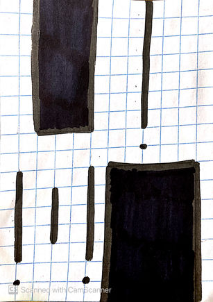
In this assignment I learn about hierarchy, which relates to compositions. One assignment I had was to create asymmetrical thumbnails that follow a hierarchy of elements. The hierarchy of elements is where in a thumbnail, we would have a primary element, which is the biggest element. Then, we have secondary elements, and they are smaller than the primary element. Finally, we have third elements, which will be smaller than secondary elements. Another thing to think about when doing thumbnails is the direction, which means am I going to create one in a horizontal, vertical, or diagonal way. Combining the direction and the elements together, we then next have to brainstorm how to organize the elements like where we should place them, what shape they should be, and etc.

About Typeface:
For this section, I divide the two ways logos are made. One, I test with different fonts and keep the arrangement of the letters the same. In this test, I want to see how fonts are related to the purpose of the logo. For instance, what font would be suitable for a business that wants to sell art supplies, which one could be used to advertise a movie, and which one could be used in comic books. It is quite fun to see how the font varies depending on the purpose of the logo. For the second test, I care less about the purpose, but I focus on the ways I could arrange, or change the shape or size of the letters to create a logo. I want to see which arrangement would look the best, in terms of harmony and balance. After the two trials, I learned that depending on the purpose of the logo, we have different ways to adjust the letters such as the shape, thickness, size, and other details so it would match with the context we are trying to use it in.


